
Why Neon Colors Are More Than Just Bright Hues
In a digital world where attention spans are shrinking, design must captivate within milliseconds. Colors are more than just visual elements—they shape emotions, direct user attention, and define brand identity. According to research, 75% of a website’s credibility relies on its design, and 39% of users prioritize color when navigating a site.
This is where neon colors come into play. They are bold, striking, and, when used effectively, can transform a brand’s presence into an unforgettable experience.
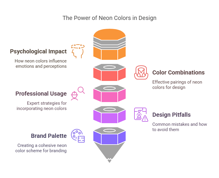
Table of Contents
- The Science Behind Neon Colors & Their Psychological Impact
- Top 20 Neon Color Combinations for Stunning Designs
- How to Use Neon Colors Like a Pro (With Real-World Examples)
- The Pitfalls of Neon Design & How to Avoid Them
- Finding the Perfect Neon Palette for Your Brand
1. The Science Behind Neon Colors & Their Psychological Impact
Why Do Neon Colors Stand Out?
Neon colors are a result of fluorescence—they absorb and emit more light than standard hues. This unique property makes them appear brighter and more intense, especially against darker backgrounds.
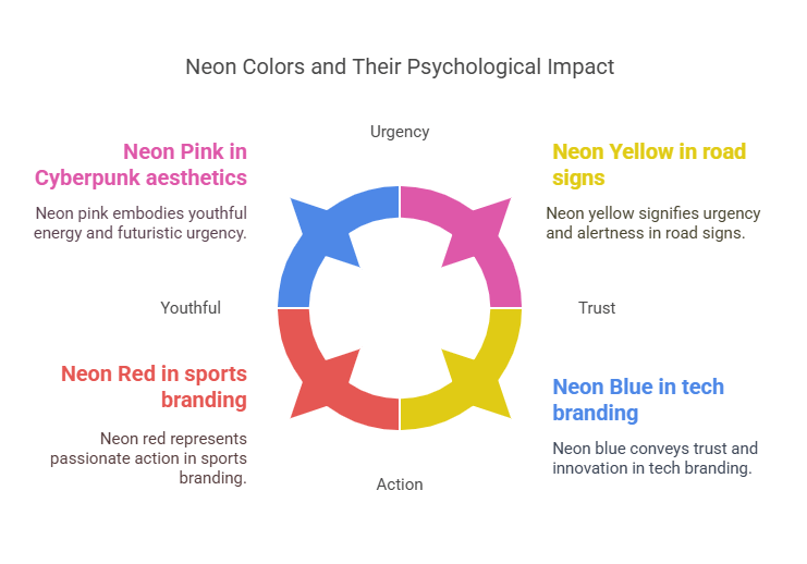
How Neon Colors Affect Human Perception
- Neon Pink & Purple: Energetic, playful, and linked to youthful, tech-driven, and futuristic themes (e.g., Cyberpunk aesthetics).
- Neon Green & Yellow: Often associated with alertness, high-energy branding, and urgency (commonly used in road signs and hazard warnings).
- Neon Blue & Cyan: Evoke trust, innovation, and digital sophistication (favored by tech and gaming industries).
- Neon Red & Orange: Represent passion, excitement, and action (frequently used in sports and entertainment branding).
Case Study: Tech giants like MSI and Intel incorporate neon blue to signify cutting-edge innovation, while brands like Stabilo use neon yellow to highlight and enhance visibility.
2. Top 20 Neon Color Combinations for Stunning Designs
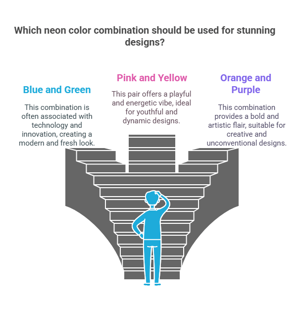
1. Vibrant Pink & Electric Green
🔹 Best For: Trendy, youthful brands
🔹 Use Case: Fashion, pop culture, social media graphics
2. Neon Cyan, Deep Blue & Bright Teal
🔹 Best For: Futuristic, tech-driven projects
🔹 Use Case: Gaming, cryptocurrency, AI startups
3. Passionate Neon Pink & Rich Red
🔹 Best For: Luxury, bold statements
🔹 Use Case: Beauty, nightlife, high-end branding
4. Warm Neon Orange & Muted Purple
🔹 Best For: Balancing intensity with sophistication
🔹 Use Case: Lifestyle brands, music industry, event promotions
5. High-Contrast Neon Yellow & Bold Red
🔹 Best For: Maximum visibility & urgency
🔹 Use Case: Sale promotions, advertising, CTA buttons
6. Neon Magenta, Lime, Yellow & Cyan
🔹 Best For: Fun, energetic branding
🔹 Use Case: Music festivals, youth-oriented promotions, modern advertisements
7. Tropical Neon Cyan, Pink & Black
🔹 Best For: High-contrast, futuristic aesthetics
🔹 Use Case: Fashion brands, nightlife promotions, gaming industry
8. Neon Cyan, Purple & Pink
🔹 Best For: Creative and artistic visuals
🔹 Use Case: Web design, digital art, eCommerce platforms
9. Neon Yellow, Orange & Pink
🔹 Best For: Warm, optimistic, and inviting tones
🔹 Use Case: Beauty industry, lifestyle products, influencer branding
10. Neon Red & Deep Blue
🔹 Best For: Strong contrast and bold designs
🔹 Use Case: Sports branding, tech innovations, edgy fashion labels
11. Futuristic Orange & Magenta Neon Combo
🔹 Best For: Cyberpunk aesthetics and sci-fi themes
🔹 Use Case: Gaming, tech events, conceptual art
12. Calming Orange & Teal Neon Mix
🔹 Best For: Balanced yet eye-catching designs
🔹 Use Case: Hospitality, entertainment, movie posters
13. Neon Orange & Dark Blue
🔹 Best For: Mysterious yet warm branding
🔹 Use Case: High-end fashion, cinematic visuals, branding campaigns
14. The Mysterious Neon Red & Blue
🔹 Best For: High-energy yet sophisticated designs
🔹 Use Case: Tech brands, eSports, futuristic storytelling
15. The Neon Magenta & Blue Gradient
🔹 Best For: Smooth transitions and striking visuals
🔹 Use Case: Digital branding, animation, product packaging
16. The Futuristic Neon Purple, Blue & Pink Color Palette
🔹 Best For: Modern, high-tech looks
🔹 Use Case: AI, robotics, corporate events
17. The Creamy Peach with Neon Yellow & Purple Shades
🔹 Best For: Elegant yet vibrant branding
🔹 Use Case: Luxury beauty brands, editorial design, boutique fashion
18. The Refreshing Neon Pink & Teal Mix
🔹 Best For: Bright and lively aesthetics
🔹 Use Case: Music videos, pop culture, casual fashion
19. The Neon Yellow, Orange, Pink & Purple Party
🔹 Best For: Playful and youthful design concepts
🔹 Use Case: Social media graphics, influencer marketing, lifestyle blogs
20. Neon Cyan & Yellow with Soft Lilac Touch
🔹 Best For: Energetic yet calming designs
🔹 Use Case: Fitness industry, futuristic branding, corporate identity
3. How to Use Neon Colors Like a Pro (With Real-World Examples)
✅ DO: Use Neon Colors for Key Elements
- Call-to-action buttons (e.g., “Sign Up Now!” in neon pink on a dark background)
- Headings & banners (to create emphasis and guide focus)
- Hover effects & animations (subtle neon glow can make interactions feel dynamic)
❌ DON’T: Overload the Design with Neon
- Avoid neon text on neon backgrounds (causes eye strain and reduces readability).
- Balance neon elements with neutral tones like black, white, gray, or beige.
Industry Example: Nike’s VaporMax campaign
Nike effectively uses neon green and blue gradients on dark backgrounds for high-impact advertising that radiates energy while maintaining a clean design.
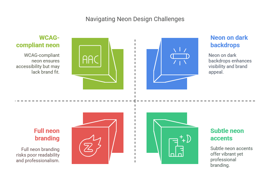
4. The Pitfalls of Neon Design & How to Avoid Them
Mistake #1: Poor Contrast & Readability
- Fix: Use neon against dark, desaturated, or monochrome backdrops.
Mistake #2: Using Neon for Corporate or Professional Brands
- Fix: Opt for subtle neon accents rather than full-fledged neon branding.
Mistake #3: Ignoring Accessibility & Color Blindness
- Fix: Ensure WCAG-compliant contrast ratios; test designs with accessibility tools.
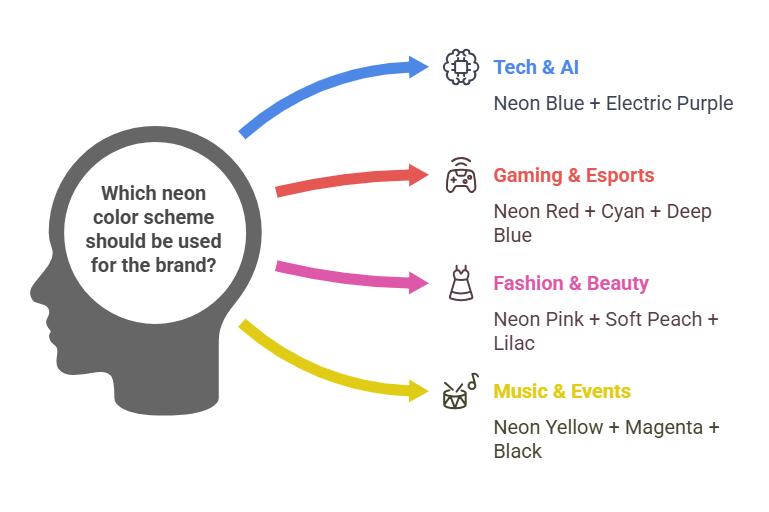
5. Finding the Perfect Neon Palette for Your Brand
Choosing the right neon color scheme depends on your industry, audience, and message.
| Industry | Best Neon Palette |
|---|---|
| Tech & AI | Neon Blue + Electric Purple |
| Gaming & Esports | Neon Red + Cyan + Deep Blue |
| Fashion & Beauty | Neon Pink + Soft Peach + Lilac |
| Music & Events | Neon Yellow + Magenta + Black |
| Luxury & High-End | Neon Gold + Muted Teal |
Pro Tip: Use A/B testing on neon CTA buttons to see what resonates best with your audience.
FAQ: Neon Colors and Related Questions
1. What are neon colors?
Neon colors are extremely bright, vivid shades that appear to glow. They are often used in design, fashion, and signage to grab attention. Common neon colors include neon pink, neon green, neon yellow, and neon orange.
2. Is black a neon color?
No, black is not considered a neon color. Neon colors are characterized by their brightness and vibrancy, while black is a dark, neutral color.
3. What color are neon lights?
Neon lights can come in various colors, including neon pink, neon green, neon blue, neon yellow, and neon orange. The color depends on the type of gas used in the light.
4. What colors are considered neon?
Colors considered neon include bright shades like neon pink, neon green, neon yellow, neon orange, and neon blue. These colors are highly saturated and appear to glow.
5. Is neon a color?
“Neon” itself is not a specific color but refers to a group of bright, fluorescent colors that appear to emit light. Examples include neon pink, neon green, and neon yellow.
6. Is orange a neon color?
Yes, orange can be a neon color. Neon orange is a bright, fluorescent shade of orange that is often used in designs and clothing.
7. Is red a neon color?
Yes, red can be a neon color. Neon red is a bright, vivid shade of red that stands out due to its fluorescent properties.
8. Is white a neon color?
No, white is not a neon color. Neon colors are bright and vibrant, while white is a neutral, non-fluorescent color.
9. What colors go with neon pink?
Colors that complement neon pink include black, white, gray, and other neon colors like neon green or neon yellow. Neutral tones help balance the brightness of neon pink.
10. What color goes with neon green?
Neon green pairs well with black, white, gray, and other neon colors like neon pink or neon yellow. Neutral colors help tone down its intensity.
11. What color goes with neon yellow?
Neon yellow works well with black, white, gray, and other neon colors like neon pink or neon green. Neutral shades provide a good contrast.
12. How do you make neon colors?
Neon colors can be created by mixing highly saturated pigments or dyes. For digital design, neon colors are achieved by using specific RGB values that produce bright, glowing effects.
13. How to make neon green food coloring?
To make neon green food coloring, mix bright green food coloring with a small amount of yellow. You can also add a tiny drop of blue to enhance the vibrancy.
14. What colors make neon pink?
Neon pink is typically made by mixing bright pink with a small amount of white to increase its brightness. For a more fluorescent effect, you can add a touch of magenta.
15. What colors make neon green?
Neon green is created by mixing bright green with a small amount of yellow. Adding a tiny drop of blue can enhance its vibrancy.
16. What are neon colors clothes?
Neon colors clothes are garments made with bright, fluorescent fabrics. These are often used in activewear, party outfits, and fashion statements to create a bold look.
17. What is the color of a neon light?
The color of a neon light depends on the gas used inside the tube. For example, neon gas produces a red-orange light, while argon gas can produce blue or purple light.
18. What is considered neon colors?
Neon colors are considered to be bright, fluorescent shades that appear to glow. Examples include neon pink, neon green, neon yellow, and neon orange.
19. What color matches with neon green?
Colors that match neon green include black, white, gray, and other neon colors like neon pink or neon yellow. Neutral tones help balance its brightness.
20. What is neon colors in Spanish?
In Spanish, neon colors are referred to as “colores neón.” For example, “qué es color neón” translates to “what is neon color.”
Final Thoughts: The Future of Neon Design
Neon colors are more than just a trend—they are a powerful tool for brands that want to make a bold statement. Whether used for modern web design, branding, or advertising, a well-balanced neon palette can captivate, engage, and convert users instantly.
Ready to create a show-stopping neon design? Let’s make your brand unforgettable! 🚀

